I got a tumblr recently.
One thing I’ve noticed is that tumblr is a very visual medium. While some people can get away with massive text-dumps, they’re usually part of specialized communities. The content that’s most popular with a wide audience is, almost always, images. And that’s especially true for science-related content.
This isn’t limited to tumblr either. Most of my most successful posts have images. Most successful science posts in general involve images. Think of the most interesting science you’ve seen on the internet: chances are, it was something visual that made it memorable.
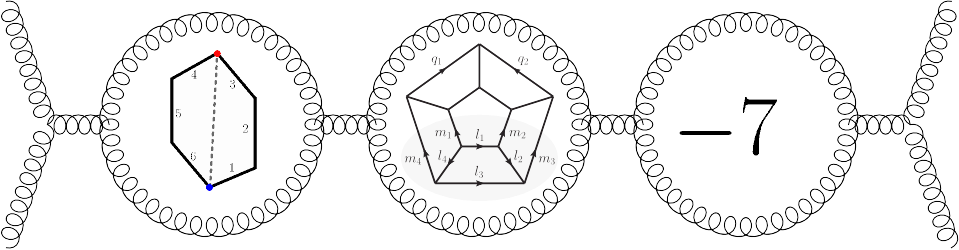
The problem is, I’m a theoretical physicist. I can’t show you pictures of nebulae in colorized glory, or images showing the behavior of individual atoms. I work with words, equations, and, when I’m lucky, diagrams.
Diagrams tend to work best, when they’re an option. I have no doubt that part of the Amplituhedron‘s popularity with the press owes to Andy Gilmore’s beautiful illustration, as printed in Quanta Magazine’s piece:
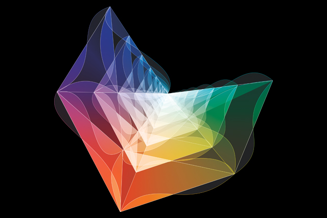
Gotta get me an artist.
The problem is, the nicer one of these illustrations is, the less it actually means. For most people, the above is just a pretty picture. Sometimes it’s possible to do something more accurate, like a 3d model of one of string theory’s six-dimensional Calabi-Yau manifolds:

What, you expected a six-dimensional intrusion into our world *not* to look like Yog-Sothoth?
A lot of the time, though, we don’t even have a diagram!
In those sorts of situations, it’s tempting to show an equation. After all, equations are the real deal, the stuff we theorists are actually manipulating.
Unless you’ve got an especially obvious equation, though, there’s basically only one thing the general public will get out of it. Either the equation is surprisingly simple,

Isn’t it cute?
Or it’s unreasonably complicated,

Why yes, this is one equation that covers seventeen pages. You’re lucky I didn’t post the eight-hundred page one.
This is great for first impressions, but it’s not very repeatable. Show people one giant equation, and they’ll be impressed. Show them two, and they won’t have any idea what the difference is supposed to be.
If you’re not showing diagrams or equations, what else can you show?
The final option is, essentially, to draw a cartoon. Forget about showing what’s “really going on”, physically or mathematically. That’s what the article is for. For an image, just pick something cute and memorable that references the topic.
When I did an article for Ars Technica back in 2013, I didn’t have any diagrams to show, or any interesting equations. Their artist, undeterred, came up with a cute picture of sushi with an N=4 on it.
That sort of thing really helps! It doesn’t tell you anything technical, it doesn’t explain what’s going on…but it does mean that every time I think of the article, that image pops into my head. And in a world where nothing lasts without a picture to document it, that’s a job well done.

What’s that old saying: “A picture is worth a whole bunch of words!” Or something like that…
LikeLike
Seems like this is a niche that some entrepreneuring artist should seek to fill. Just like there are now subspecialties in visual arts for medical illustration, for example, mightn’t there also be room for a subspecialty for elegant/catchy visualizations of complex ideas?
LikeLike
I’m pretty sure there is already, actually. That is, there are definitely visual artists who specialize in science visualizations, though that’s rarely the only thing they work on. Perimeter might even have some on-staff, the big science magazines definitely do.
LikeLike